组件名为commonTable,主要是基于element-ui中的表格组件进行二次封装的组件,集成了常用的表格功能,除默认内容的显示外,还包括以下几点:
1. 状态的筛选和显示;
2. 操作按钮的显示和方法绑定;
3. 自定义具名插槽内容的封装;
4. 表格内容的翻页。
除了提供的常用功能外,主要是希望可以通过组件的封装和应用,进一步理解和应用SPA框架主推的数据驱动理念,真正通过数据来描述页面应用。我们来看具体代码:
应用实例:
<!-- 表格组件 -->
    <CommonTable :tableData="tableData" :tableConfig="tableConfig" :pageConfig="pageConfig"></CommonTable>
组件包含三个主要参数,分别是:
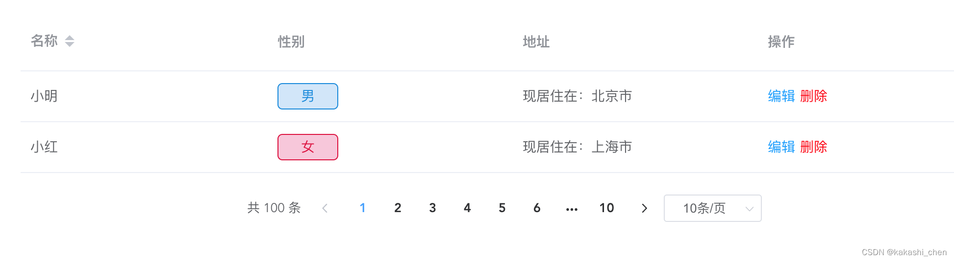
tableData:表格组件的数据内容,通常通过后端接口获取;
// 表格数据内容
        tableData: [
            {
                "id": "001",
                "name": "小明",
                "sex": 1,
                "address": "北京市"
            },
            {
                "id": "002",
                "name": "小红",
                "sex": 2,
                "address": "上海市"
            }
],tableConfig:表格组件的配置,通过这个配置,组件自动生成表格;
// 表格配置
        tableConfig: [
          {
              label: "名称",
              prop: "name",
              sortable: true,
          },
          {
              label: "性别",
              prop: "sex",
              type: "status",
              callback: (scope) => {
                switch(scope.row.sex) {
                  case 1 :
                    return {
                      text: '男',
                      color: 'blue'
                    }
                  case 2 :
                    return {
                      text: '女',
                      color: 'red'
                    }
                }
              }
          },
          {
              label: "地址",
              prop: "address",
              type: "slot"
          },
          {
              label: "操作",
              prop: "operate",
              type: "operate",
              operateList: (scope) => {
                return [
                  {
                    text: "编辑",
                    callback: (scope) => {console.log("编辑"+scope.row)}
                  },
                  {
                    text: "删除",
                    color: "red",
                    callback: () => {console.log("删除"+scope.row)}
                  },
                ]
              }
          },
],pageConfig:表格组件的分页配置,翻页等方法也都在这里配置,如果不写,默认没有分页功能。
// 分页配置
        pageConfig: {
          sizeChange: (val) => {console.log('sizeChange--'+val)},
          currentChange: (val) => {console.log('currentChange--'+val)},
          pageSizes: [10, 20, 50],
          layout: "total, prev, pager, next, sizes",
          pageSize: 10,
          total: 100,
          currentPage: 1
        }
表格主要分为四种不同类型的内容,通过type来区分不同类型,当没有type值的时候,就传入默认的数据内容,下面详细看下代码:
1. 自定义类型:(type: slot)
通过vue的具名插槽的功能,在组件中插入同名的插槽,插槽名为prop属性内容,插槽内容可以自定义,通过scope传入表格当前行的数据来进行数据操作。vue提供了一个方法来进行动态的具名插槽绑定,用v-slot动态绑定插槽名。
<!-- 示例 -->
    <CommonTable :tableData="tableData" :tableConfig="tableConfig" :pageConfig="pageConfig">
        <template v-slot:self="{ scope }">
            <div>{{ scope.row }}</div>
        </template>
    </CommonTable>
<!-- 自定义类型 -->
<el-table-column
v-if="item.type === 'slot'"
:key="index"
:prop="item.prop"
:width="item.width"
:label="item.label"
:sortable="item.sortable">
<template slot-scope="scope">
<slot :name="item.prop" :scope="scope"></slot>
</template>
</el-table-column>2.状态类型:(type: status)
表格中经常会用到一些用来标识状态的标签,例如性别、身份等。并且经常会遇到需要对后端接口提供的数据进行转义,例如等于1的时候是男性,等于2的时候是女性。可以在组件中提前封装好需要的状态类型标签,并且内容和颜色,可以通过text和color两种属性来自由搭配。保证了全局标签样式的统一性的同时,也提供了一定的可自定义化。
<!-- 状态类型 -->
<el-table-column
v-if="item.type === 'status'"
:key="index"
:prop="item.prop"
:width="item.width"
:label="item.label"
:sortable="item.sortable">
<template slot-scope="scope">
<span v-if="item.callback(scope).color === 'blue'" class="status-label label-blue">{{ item.callback(scope).text }}</span>
<span v-if="item.callback(scope).color === 'red'" class="status-label label-red">{{ item.callback(scope).text }}</span>
<span v-if="!item.callback(scope).color">{{ item.callback(scope).text }}</span>
</template>
</el-table-column>3. 操作类型:(type: operate)
表格最后一列通常包含相应的操作,例如编辑、删除等。在组件中封装好操作类型,在使用的时候可以灵活搭配操作按钮的展示内容和绑定的方法。operateList返回按钮列表,通过名为show的属性可以根据不同的条件应用不同的按钮,通过callback属性来绑定按钮的方法。
<!-- 操作类型 -->
<el-table-column
v-if="item.type === 'operate'"
:key="index"
:prop="item.prop"
:width="item.width"
:label="item.label"
:sortable="item.sortable">
<template slot-scope="scope">
<template v-for="(operateItem, operateIndex) in item.operateList(scope)">
<span
v-if="operateItem.show === undefined || operateItem"
:key="operateIndex"
@click="operateItem.callback(scope)"
:class="['operate-button', operateItem.color === 'red' ? 'operate-red' : '']">{{ operateItem.text }}</span>
</template>
</template>
</el-table-column>4. 默认类型:(type: none)
当type值不存在的时候,默认展示prop属性对应的表格数据内容。
<!-- 默认类型 -->
<el-table-column
v-if="!item.type"
:key="index+index"
:prop="item.prop"
:width="item.width"
:label="item.label"
:sortable="item.sortable"
:show-overflow-tooltip="true">
<template slot-scope="scope">
<span>{{ scope.row[item.prop] }}</span>
</template>
</el-table-column>总结一下,在element-ui的table组件和pagination组件的基础上进行封装,以达成全局数据驱动渲染表格内容,实现表格展示和操作的目的。
四种类型分别是:
自定义类型、标签类型、操作类型和默认类型。
三个主要参数是:
tableData(数据内容)、tableConfig(表格配置)、pageConfig(分页配置)
属性说明:
1. 通过label属性或者text属性参数来展示表格需要显示的内容;
2. 通过prop属性来绑定对应数据的字段名;
3. 通过show属性来绑定内容是否显示的条件,通过color属性绑定内容样式;
4. 通过callback属性绑定需要的操作方法,callback中的scope参数绑定当前数据内容。
组件优势:
全局数据驱动,统一表格组件的同时,提供了表格展示内容和操作方法的灵活绑定,并提供了动态具名插槽进行内容自定义。
看下渲染后的效果:
最后附上完整组件代码:文章来源:https://www.uudwc.com/A/y54Ym/
<template>
<div class="common-table">
<el-table
:stripe="stripe"
:height="height"
:data="tableData"
:config="tableConfig"
empty-text="暂无数据">
<template v-for="(item, index) in tableConfig">
<!-- 自定义类型 -->
          <el-table-column
            v-if="item.type === 'slot'"
            :key="index"
            :prop="item.prop"
            :width="item.width"
            :label="item.label"
            :sortable="item.sortable">
            <template slot-scope="scope">
              <slot :name="item.prop" :scope="scope"></slot>
            </template>
          </el-table-column>
<!-- 状态类型 -->
          <el-table-column
            v-if="item.type === 'status'"
            :key="index"
            :prop="item.prop"
            :width="item.width"
            :label="item.label"
            :sortable="item.sortable">
            <template slot-scope="scope">
              <span v-if="item.callback(scope).color === 'blue'" class="status-label label-blue">{{ item.callback(scope).text }}</span>
              <span v-if="item.callback(scope).color === 'red'" class="status-label label-red">{{ item.callback(scope).text }}</span>
              <span v-if="!item.callback(scope).color">{{ item.callback(scope).text }}</span>
            </template>
          </el-table-column>
<!-- 操作类型 -->
          <el-table-column
            v-if="item.type === 'operate'"
            :key="index"
            :prop="item.prop"
            :width="item.width"
            :label="item.label"
            :sortable="item.sortable">
            <template slot-scope="scope">
              <template v-for="(operateItem, operateIndex) in item.operateList(scope)">
                <span
                  v-if="operateItem.show === undefined || operateItem"
                  :key="operateIndex"
                  @click="operateItem.callback(scope)"
                  :class="['operate-button', operateItem.color === 'red' ? 'operate-red' : '']">{{ operateItem.text }}</span>
              </template>
            </template>
          </el-table-column>
<!-- 默认类型 -->
          <el-table-column
            v-if="!item.type"
            :key="index+index"
            :prop="item.prop"
            :width="item.width"
            :label="item.label"
            :sortable="item.sortable"
            :show-overflow-tooltip="true">
            <template slot-scope="scope">
              <span>{{ scope.row[item.prop] }}</span>
            </template>
          </el-table-column>
</template>
</el-table>
<!-- 分页 -->
<el-pagination
v-if="pageConfig"
class="table-page"
@size-change="pageConfig.sizeChange"
@current-change="pageConfig.currentChange"
:page-sizes="pageConfig.pageSizes"
:layout="pageConfig.layout || 'total, prev, pager, next, sizes'"
:page-size="pageConfig.pageSize"
:current-page="pageConfig.currentPage"
:total="pageConfig.total">
</el-pagination>
</div>
</template>
<script>
export default {
props: {
tableConfig: {
type: Array,
default: () => []
},
tableData: {
type: Array,
default: () => []
},
pageConfig: {
type: Object,
default: () => {}
},
stripe: {
type: Boolean,
},
height: {
type: String,
},
},
data () {
return {}
},
mounted() {
},
methods: {
}
}
</script>
<style lang="scss">
.operate-button {
display: inline-block;
margin-right: 5px;
color: #09f;
&:hover {
cursor: pointer;
}
}
.operate-red {
color: #f00;
}
.status-label {
display: inline-block;
width: 60px;
height: 25px;
text-align: center;
line-height: 25px;
border-radius: 5px;
}
.label-blue {
background: rgba(164, 205, 245, 0.5);
color: #0888de;
border: 1px solid #0888de;
}
.label-red {
background: rgb(240 141 181 / 50%);
color: #de083a;
border: 1px solid #de083a;
}
</style>
文章来源地址https://www.uudwc.com/A/y54Ym/